Content Over Images: How Does This UX/UI Trend Impact Accessibility?
![]() Jun 30, 2020
Jun 30, 2020
By Dani Belvedere

Trends exist in every work environment. When it comes to design, the latest trends are often used by designers when creating content or updating a website. One design trend we’re seeing a lot of lately is the use of content over images or content on irregular backgrounds (e.g. a photograph for a news article preview with a link to the extended version, or a banner with text over an image). While visually appealing, what happens when we analyze this trend from an accessibility point of view?
According to WCAG Success Criterion 1.4.3, text bigger than 18pt or 14pt in bold should have a minimum contrast ratio of 3:1, otherwise, the contrast ratio between text and its background should be at least 4.5:1. This seems logical and pretty easy to achieve when talking about solid backgrounds, but what about irregular ones?
We’ll highlight two examples of non-accessible content commonly found on websites and offer tips on how to fix it.


In the first example, you’ll notice dark text over an image with dark areas where the contrast ratio is very low. In the second example, something similar happens, but with light text over an image with light spots where the contrast ratio is also low.
How do you remediate these situations?
Opacity layers
Adding an additional opacity layer between the image and the text is one option. If the text has a light color, a dark opacity layer should be used. Alternatively, if the text has a dark color, you should use a light opacity layer. If opacity layering for a whole image is too visually invasive, you can use an opacity gradient and position the text over the section with the most solid color to have a compliant contrast ratio.


Text border and outer shadow
If opacity layering doesn’t do it for you, you can try adding a border or an outer shadow to your text. However, keep in mind that the contrast ratio for borders and shadows is measured against the text body and not the background like the previous technique.
If you choose to use borders for your text, it’s important to note there are two aspects to this technique: border width and border color. When it comes to border width, the contrast ratio between the border and the font body should be at least 4.5:1. Yet, if the width is 3px or greater, the minimum contrast ratio goes down to 3.0:1.
On the contrary, if you choose to use outer shadowing, shadow properties should obviously be taken into account. These are: distance, opacity, spread and size.
- Distance: the value must be 0px because contrast ratio measurement is done between adjacent colors.
- Opacity: the transparency should be high enough for the background to be differentiated from the shadow color.
- Spread: the percentage should be low enough for the shadow not to be blurred.
- Size: the value must be set in accordance with the spread, as a 3px shadow size will not be effective as a means to achieve compliance if the spread percentage is too high.


No images
If achieving the 1.4.3 success criterion is too difficult even after applying opacity layering, text border, outer shadowing or a combination of those techniques, the safest option might be avoiding using images with an irregular background altogether. However, don’t be discouraged! You can play with color combinations and contrast, as backgrounds don’t have to be complex to have a powerful impact or to be aesthetically pleasing.

What tools will check contrast ratio?
There are many options out there, but some of the most popular include:
- Colour Contrast Checker for Chrome
- Color Safe – A website that creates beautiful and accessible color palettes based on WCAG Guidelines of text and background contrast ratios according to the font size and font type you use.
- Equating Color and Transparency
- Text on Background Image Accessibility Check
The Forrester Wave™: Digital Accessibility Platforms, Q4 2023
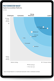
The first-ever digital accessibility Forrester Wave provides objective analysis of the most significant solution providers, recognizing Level Access as a Leader.
Access the reportSubscribe for updates